
What You’ll Learn
By the end of this guide you will be able to read the two cumulative flow areas and the Net Flow summary, use the per-minute bars to time bursts of urgency, understand exactly which trades this chart counts (and which it ignores), and know when to prefer it over Net Drift — and when not to.What Net Flow Is
Net Flow is the most selective of the GEX-family views. It counts only trades that printed at or above the ask — the subtitle says so explicitly: At Ask, Above Ask. Paying the offer (or worse) is the clearest available signature of urgency: that buyer wanted in now and did not wait for a better price. Everything else — bid-side fills, mid-market prints, patient limit executions — is ignored entirely. What remains is a running tally of urgent premium: a teal area for cumulative ask-side call premium and a red area for cumulative ask-side put premium.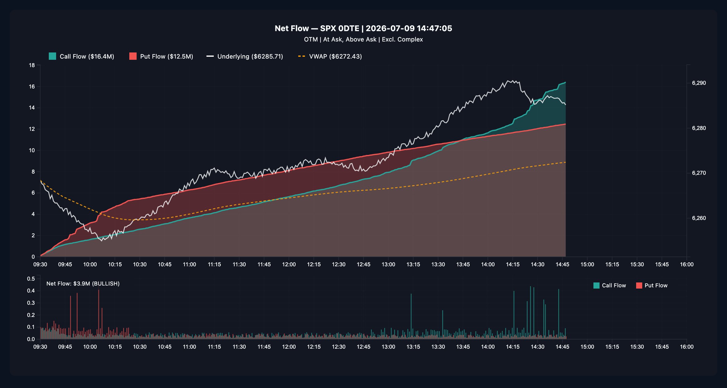
Panel 1 (top): Cumulative Ask-Side Flow
What you see:- Teal area + line — cumulative ask-side call premium (left axis; the legend shows the running total, e.g. Call Flow ($16.4M))
- Red area + line — cumulative ask-side put premium (Put Flow ($12.5M))
- White line — SPX price (right axis)
- Dashed amber line — session VWAP, anchored at 9:30 ET (right axis)
- Both areas only ever grow — this is a gross tally of urgent premium, not a netted one. What matters is their relative slope: which side is accumulating faster right now?
- Steepening teal = call buyers paying up. Steepening red = put buyers paying up. A side going flat means its urgency dried up — often as informative as a surge.
- Read slopes against the price overlays. Urgent call premium while spot holds above VWAP is with-trend; urgent put premium printing into a rally is a disagreement worth investigating.
Panel 2 (bottom): Per-Minute Flow + the Summary
What you see: paired teal (call) and red (put) bars for each minute — side-by-side, so you can compare heights directly — plus the summary label:Net Flow: $3.9M (BULLISH)The summary is simple arithmetic: cumulative ask-side call premium minus cumulative ask-side put premium, with the sign labeled. It describes the chart’s lean, not an instruction. How to read the bars: this is the urgency timeline. Sustained tall teal bars are persistent call demand; a sudden red spike from a quiet tape is a concentrated put print — hedging or directional, the chart cannot tell you which, only that someone paid up for it. Sweep the crosshair to timestamp the spikes, then check GEX Interval for the strikes they hit. The crosshair tooltip shows, for any minute: Call Flow, Put Flow, SPX, VWAP, Call/Min, and Put/Min.
Net Flow vs. Net Drift
The two charts look related and are often confused. They answer different questions:
They diverge in instructive ways. Strong teal Net Flow with a weak call line on
Net Drift means calls printed aggressively at the ask while comparable call
selling offset it — urgency present, accumulation absent. The reverse (rising
call drift, quiet Net Flow) means the call side is being accumulated patiently,
inside the spread, without paying up.
Why It Helps
- It isolates the least ambiguous prints on the tape. Every dollar on this chart came from someone crossing the spread. No inference, no mid-print guessing.
- It is the cleanest urgency timer. The per-minute bars show exactly when aggressive interest arrived — useful for connecting a price move to the flow that accompanied it.
- As a cross-check, it validates or undercuts what Net Drift and the GEX structure suggest. Agreement across the three is a much stronger read than any one alone.
How To Use It Well
1
Confirm what you're reading
The subtitle should say At Ask, Above Ask — that is the whole point of
this chart. Live views refresh every 1 minute and show an
Updated N min ago badge.
2
Compare slopes, not sizes
Total areas accumulate all day; the current slope of each side is the
live information. Ask: in the last 30 minutes, which side is steeper?
3
Timestamp the spikes
Crosshair the tall bars in Panel 2. A cluster of urgent put prints at 10:05
during a selloff tells a different story than the same cluster during a
rally.
4
Reconcile with Net Drift
Urgency without accumulation (or the reverse) is a nuance you only see by
reading both — the table above tells you how to interpret each mismatch.
5
Map the flow onto structure
Urgent premium aimed at a strike matters more when that strike is a wall on
GEX Combined or a tagged row on the
GEX Ladder.
Common Misreads
- “Net flow is bullish, so buy calls.” The chart records what already happened; by the time the lean is obvious, the tape has moved. Use it as context with price and levels.
- “Flat flow = quiet market.” Flat means no ask-side dominance. Heavy patient, passive, or mid-market activity is invisible here — check Net Drift before calling the session dead.
- “This is Net Drift with different colors.” Net Flow never subtracts selling — it cannot fall. The two disagree precisely when patient flow and urgent flow tell different stories.
- “Urgent put buying means someone knows something.” It can be systematic hedging, a spread leg the complex filter didn’t classify, or a fund rebalancing. Urgency says someone paid up, not why.
Strengths and Limitations
Where Net Flow is strong- Highest signal-per-print of the flow views: everything counted required a trader to cross the spread.
- Gross accumulation makes trends easy to see — the areas never whipsaw the way netted lines can.
- The summary label reduces the chart to one auditable number.
- It ignores most of the tape by design — bid-side, mid-market, and inside-spread activity do not exist here. It is a lens, not a census.
- Ask-side prints are presumed urgent buying, but classification against quotes is a heuristic and individual prints can be misread.
- Gross tallies never come back down: a side that dominated the morning can look dominant all day even after its urgency stopped. Always read current slope, not total area.
- It covers SPX 0DTE only and cannot distinguish opening from closing trades, or directional bets from hedges.