
What You’ll Learn
By the end of this guide you will be able to read the GEX Interval bubble map, tell fresh gamma from stale gamma, use the price path to judge whether activity led or chased the market, and pair the view with GEX Combined so you know both where a level is and when it was built.What GEX Interval Is
GEX Combined shows the day’s gamma as one cumulative picture — a wall on that chart could have been built at 9:35 AM or five minutes ago, and the chart looks the same either way. GEX Interval breaks the same flow apart by time. Its in-app title says exactly what it is: the GEX Evolution Map. Every bubble is one answer to the question: how much hedging weight do the positions built at this strike, during this slice of the day, carry right now? Time runs left to right across the regular session (9:30–16:00 ET), strike price runs bottom to top, and the day’s flow paints itself across the grid in 5-minute intervals (the subtitle shows the interval size, e.g. 5-min, and the strike window, e.g. ±$100). The important subtlety: a bubble’s position is historical, but its value is live. The map remembers which contracts traded in each slice and values them at the current market state — see Bubbles revalue as the day moves below.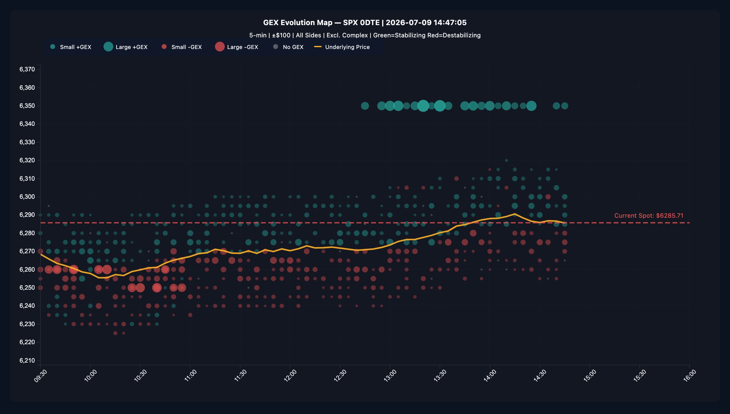
How To Read the Map
The color convention is the same dealer-positive one used across the GEX views —
the subtitle spells it out: Green=Stabilizing Red=Destabilizing.
The x-axis labels use 24-hour time (e.g. 13:30); the hover tooltip uses
12-hour time (e.g. 1:30 PM). Same clock, two formats.
Early in the session the panel says “Pending”. A bubble cannot exist until
its interval closes, so on the default 5-minute setting the first one appears
at 9:35 AM ET. Until then the panel tells you when to expect data rather
than showing an error — there is nothing wrong, the session simply has not
produced a bucket yet.
Bubbles Revalue As The Day Moves
GEX Interval is a current-state view with a time axis, not a photo album. Each bubble permanently remembers which net contracts traded at its strike during its slice — that never changes. But the gamma those contracts represent is recalculated against the current option chain and the current SPX level on every refresh. So on a live day, bubbles you have already seen will shrink, grow, and occasionally change shade as the session evolves. Why it works this way: the map is built to answer “what dealer hedging pressure do the day’s positions represent right now?” — the same current-state model as GEX Combined, so a strike’s bubbles here and its bar there always agree. 0DTE gamma is intensely concentrated near the money and decays all afternoon, which produces two effects worth internalizing:- Morning bubbles at strikes price has left behind fade on their own. As the market walks away and expiry approaches, those contracts’ gamma collapses — the bubbles shrink even though nobody traded. That fading is real (the positions genuinely matter less now), but it is revaluation, not evidence that the positions were closed.
- Bubbles near the current price carry the most weight. An interval that built positions at a strike the market later returned to will look heavier than it did when it first printed.
Want the frozen-history version of a strike’s story? The
GEX Ladder strike popover is an immutable recording —
each of its points is captured at the moment it happened and never restated.
Use the Interval map for current weight by build-time, the ladder popover for
what the measurement actually was at each moment.
The four timing patterns
The map’s value is in when and where bubbles appear relative to the price path:- Bubbles at the price path, right now — the current battleground. Gamma is accumulating exactly where price trades, so expect that strike to influence the next leg.
- Bubbles far from the path, ahead of price — positioning at levels price has not reached. In the screenshot, the 6,350 stack builds all afternoon while price is 60+ points lower: the market is constructing a ceiling in advance. Cross-check that strike on GEX Combined and the GEX Ladder.
- Bubbles behind the path, after a move — reaction and re-hedging. Common after a fast push; it tells you the move is being absorbed, not anticipated.
- Big bubbles early, nothing since — stale structure. The level still exists on GEX Combined, but nobody has reinforced it in hours. Treat it as background, not as an active wall. One caution: because bubbles revalue, early bubbles at strikes far from the current price also shrink on their own as 0DTE gamma decays — a faded morning bubble means “this matters less now,” which is a blend of no reinforcement and revaluation. To separate the two, check the strike’s frozen history in the GEX Ladder popover.
The Hover Tooltip
Hover any time slice and a crosshair snaps to it, highlights that interval’s bubbles, and opens a tooltip showing:- The interval’s time and, on the right, Spot: at that moment
- Top strikes by |GEX| (8) — the interval’s largest prints, strike by
strike, each signed and colored (e.g.
+\$12.40M,-\$3.10M) - Net GEX — the sum across all strikes in that interval, not just the top eight
Paired With GEX Combined
The two charts are designed as a pair:
A workflow that uses both: identify the day’s biggest walls on GEX Combined,
then find them here and ask was that wall built this morning or in the last 30
minutes? A wall being actively stacked (like 6,350 in the screenshot) is live
structure; one untouched since the open is history.
Why It Helps
- It separates fresh from stale. Cumulative charts cannot; this one is built for exactly that distinction.
- It reveals intent vs. reaction. Gamma added ahead of price reads as positioning; gamma added behind price reads as hedging a move that already happened. The price path overlay makes the comparison visual.
- It shows the day’s rhythm. Opening bursts, midday quiet, and closing-hour re-hedging each have a recognizable bubble signature once you have watched a few sessions.
How To Use It Well
1
Orient on the price path
Trace the amber line first — it anchors every bubble in market context. Then
find the dashed Current Spot line to see where the session stands now.
2
Scan the current column
The right edge of the bubble field is the freshest activity. Strikes lighting
up there are the ones to watch into the next hour.
3
Replay the day with the crosshair
Sweep across the morning and midday. Note which strikes dominated each phase
and whether their bubbles were green or red — that is the story of how the
current structure got built.
4
Confirm levels on the cumulative views
A strike that keeps printing bubbles should show a growing bar on
GEX Combined and a brightening row on the
GEX Ladder. If it does not, the activity is
two-sided and canceling out — check the ladder’s popover for the split.
Common Misreads
- “A big bubble is a price target.” A bubble marks where gamma was added, not where price is headed. Its meaning depends on sign, and on whether later intervals keep reinforcing it.
- “Green bubbles above spot are bullish.” They are stabilizing — they can act as a ceiling exactly as often as a cushion. Direction needs price and flow context.
- “No bubbles = nothing happening.” The map shows net gamma added per interval. Balanced two-way activity in an interval can produce small or gray bubbles while volume is heavy — check Net Drift for the premium picture.
- “Morning bubbles still matter at 3 PM.” Only if the level kept getting reinforced — and the map itself already prices this in: 0DTE gamma decays through the day, so unrefreshed morning bubbles literally shrink as the session ages. What you see at 3 PM is their current weight, not their 9:40 AM weight.
- “That bubble was smaller an hour ago — the data changed.” It did, by design. The bubble’s contracts are fixed; its gamma value tracks the current market state. If you want measurements that never restate, that is the GEX Ladder popover’s frozen recording, not this map.
Strengths and Limitations
Where GEX Interval is strong- It is the only GEX view with a time axis — the freshness question is unanswerable anywhere else.
- The price-path overlay makes lead/chase relationships visible at a glance.
- Live data refreshes every 1 minute, and the panel shows how long ago the last successful refresh happened.
- Bubbles are net-per-interval: heavy but balanced two-way trading shrinks toward zero, so the map understates activity even while it correctly states net gamma.
- Bubble values are current-state, not archival: on a live day the map is not a stable record of what each interval measured at the time. Comparing a bubble against a screenshot from two hours ago compares two different valuations of the same contracts.
- The same classification caveats as every flow view apply: mid-market prints carry no direction, and the stabilizing/destabilizing signs rest on modeling assumptions about dealer positioning.
- It covers SPX 0DTE only, in fixed intervals — it is a timing map, not a tick-by-tick tape.